
A.M. Interiors Rebranding Initiative
The Problem
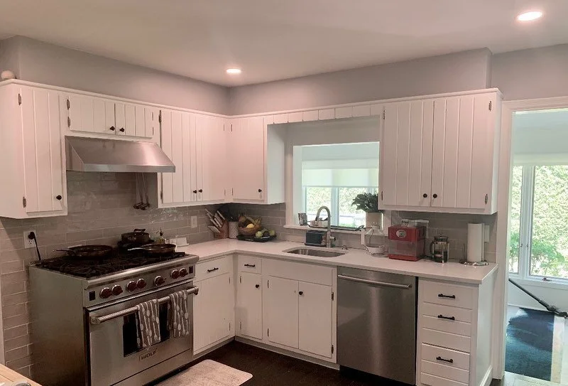
The founder and lead designer of A.M. Interiors wished to rebrand her business to expand its reach and appeal. Her goal was to modernize her marketing collateral, optimize her website, and establish a stronger presence on social media platforms.
The Process
In the rebranding process, the development of a new logo is essential. Prior to engaging in the ideation phase, research into design trends is imperative to initiate discussions with the client and gain a better understanding of their needs. I utilized Pinterest to spearhead my search.
Logo Research & Inspiration
The designer commissioned the creation of a new logo as a pivotal step in her comprehensive rebranding initiative. She wanted a sleek, modern and polished design that better aligned with her style. Additionally, she expressed the desire to maintain continuity with her previous logo's content, retaining her initials "A.M." alongside the word "interiors" to convey her professional services.
In maintaining alignment with the original brand identity, a decision was made to retain the existing color palette, a neutral pale pink. While the color pink is associated with positive attributes such as tranquility, compassion, and care, it also signifies sweetness, innocence, and playfulness. In societal contexts, these traits might be perceived as childish. Notably, the initial logo's script typeface, when coupled with the color pink, accentuates this connotation.
To combat this, I incorporated modern serif typefaces in the designs to harmonize the pink color with a sense of femininity and elegance. Additionally, I considered the preference for a border, mirroring elements from her previous design. I provided filled versions of the redesign as well to ensure logo versatility across different marketing materials.
Ultimately, a design was selected and minor adjustments began to optimize its effectiveness. During this process, the typeface was carefully curated, leading to the selection of Century Gothic Pro for its clean and contemporary aesthetic.
Logo Design Development
The next phase in the rebranding process involved the refinement of her website. Opting for continuity, I maintained her website on the established content management system, GoDaddy. The homepage had a centered logo with navigation links for Home, Services, Projects, and Contact. The background was pink with repeated, faded "A.M. Interiors" in a darker shade of pink. This design choice raised concerns regarding redundancy and visual clutter.
First, I changed her logo to the new design and made it flush left. Recognizing the significance of a user's first impression, I removed the extraneous background image, incorporating instead an image showcasing her previous work.
Her footer needed attention because there was no differentiation from the content on the page as it was all the same white color. It also lacked information usually associated with a footer due to its permanent placement on a website. To address this, I integrated a pink background and added her site navigation, contact information, and social buttons. Having the navigation in the footer enhances the website's user-friendliness by emphasizing accessibility and convenience for users.
To complete the page, it was crucial to incorporate an interactive element for enhanced user engagement. I implemented a call-to-action button to maintain consistency across the website. Introducing her slogan, “Beautiful Spaces for Better Living,” alongside a “schedule a consultation” button not only demonstrated convenience but also motivated users to actively explore and learn about her services.
I felt that the brief About section at the end of the homepage required its own page where it could be adequately represented. Promptly, I transferred the content, incorporating contact information, and introduced a call-to-action button for scheduling consultations.
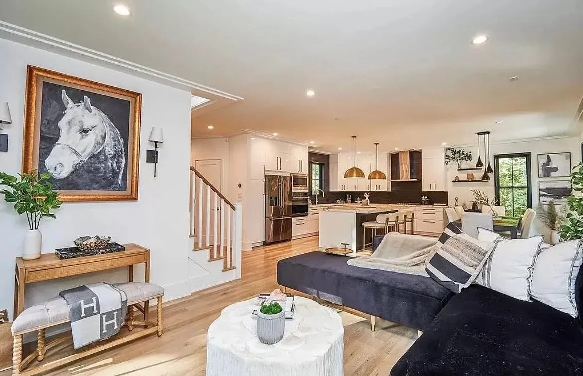
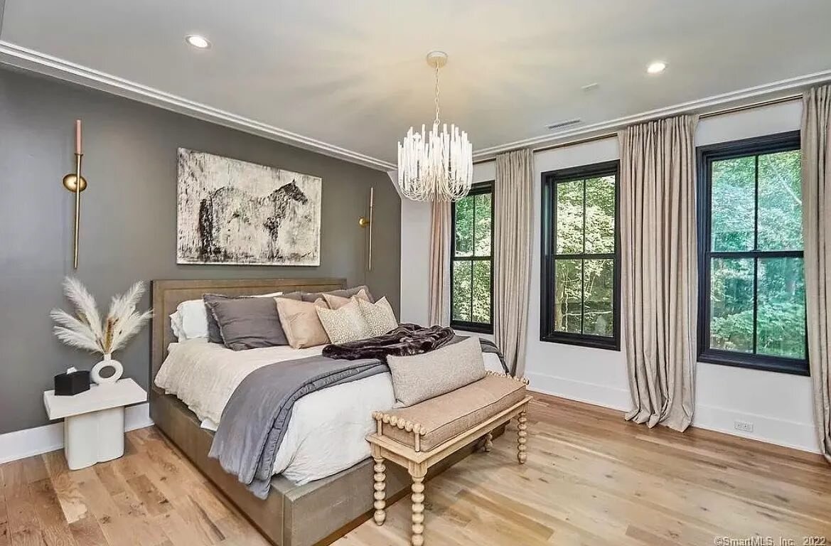
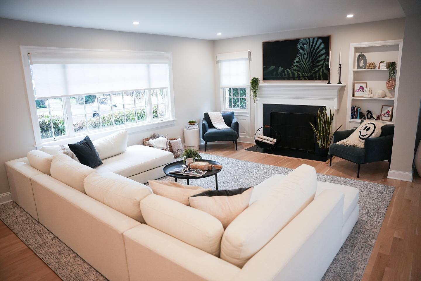
I wanted the page to do more than describe the designer's personality; I aimed for it to entice users to utilize her services. While assessing the content throughout the website, I found information better suited to accompany the about description. It outlined the steps users needed to take to get started working with the designer. I also updated the image to one that showed the designer and her work simultaneously.
Given that the services page is likely the most frequently accessed by clients, it was crucial to enhance both its visual appeal and usability. The page consisted of her different consultations and package options. The consultations featured an image, service title, and a booking button.
Initially, the images were her logo, but she expressed a preference for graphics relevant to each consultation type. Consequently, I created visuals that seamlessly aligned with the nature of each consultation.
The layout of the list of packages resulted in excessive white space on the page and hindered visual appeal. To maintain consistency with the graphic imagery, I crafted illustrations representing the various package types, incorporating her designated colors. Additionally, I selectively integrated the logo into some of the designs to emphasize the custom nature of these graphics. Thus, highlighting the effort invested in enhancing her business.
The project's page was initially set up as a carousel, which is less than ideal since users tend to browse quickly, limiting content visibility and reducing the chances of capturing their attention. Changing the layout to a stacked image collage was vital for better accessibility and increased user engagement.
The navigation's final option was the contact page. The designer wished to have as many contact options as possible. However, the page lacked sufficient contact details and included an excess of information that was not appropriately aligned.
Therefore, I opted to move the content to the About page, where it was a better fit. After this adjustment, I ensured the contact page contained essential information to reach the designer. Aptly, I included a final call-to-action button for scheduling a consultation.
Lastly, I moved on to finalize the contact form. To address the designer's concern about choosing the best contact method, I added the question, "How would you like to be contacted?" to the form. This allows users to choose their preferred means of communication.
Website Implementation
To comprehensively rebrand her business, I crafted new marketing collateral. Starting with the business card, I promptly generated alternatives based on her previous design.
In the end, a design was selected, but certain adjustments were required to align with the client's vision.
In contrast to the other designs, this business card declutters the front side, emphasizing the use of color as the focal point. Additionally, I designed new icons to tailor the appearance to her chosen color palette. Lastly, a subtle modification was made to the website link, removing the “www.” as it was deemed unnecessary and took up space.
The designer requested to switch the images to have the graphic on the pink background. However, I suggested flipping the orientation of the card design to follow expected readability patterns.
As we continued to develop the design, the collective decision to remove the graphic and slogan was made due to its overpowering presence.
Collateral Creation
After rebranding the designer's business, I moved on to her social media accounts. She wished to use Instagram more but is not familiar with how to navigate the platform. Additionally, she is unsure about the kind of content that suits her business for optimal expansion.
The designer took the initial steps in establishing an online presence by setting up a business account, incorporating her logo, and adding a link to her website. However, there were no posts created.
Instinctively, I uploaded her new logo and incorporated her industry category to enhance her search engine optimization (SEO). I aimed to grow her followers; Given her very friend and family-oriented customer base, I deemed it fitting to post on her personal account, encouraging connections to follow her business profile. I actively interacted with other accounts of professional interior designers to broaden her exposure as well.
In terms of content, I believe that an introductory post would be ideal, considering she has a clean slate. I utilized Canva to create this update.
I aimed to enhance visibility, so I crafted a story that featured additional contact details. Both content sources included a link to her website, urging viewers to schedule a consultation, and showcasing an eye-catching image of her past projects.
I opted to implement a before-and-after layout of the freshly designed space. Crafting an engaging caption, I encouraged users to swipe if they wanted to see the renovation. Additionally, I introduced hashtags to the post, experimenting with variations to identify which ones garnered the highest engagement.
Designing someone's home often involves a considerable amount of time, making it impractical to wait for another project to be revealed. Therefore, I introduced a behind-the-scenes post showcasing the start of her new project. This not only allows for multiple posts related to the same project but also provides a comprehensive view of the design journey from start to finish.
Stories offer considerable flexibility for sharing diverse content. I wanted to implement an initiative to have at least one story a day. I created the concept of “(Designer’s Name) Design Tips” as a recurring content series to engage users.
Another recurring story idea was “(Designer’s Name) Answers.” The Q&A format was a wise decision because it provided opportunities for followers to engage with our stories while simultaneously getting advice.
My goal was to ensure visual appeal in every story. When I wasn’t using the branded color palette, I chose soft neutral tones in line with current design trends and aesthetic preferences. Therefore, when crafting a story to respond to user inquiries, I preferred crafting a custom design rather than utilizing Instagram's pre-made answer stickers.
As both of these series provide valuable information, I opted to turn them into highlights, allowing users to revisit them at their convenience. Once more, I adhered to the color palette and typography to maintain a cohesive profile aesthetic.
Online Presence
The Grid


Outcomes & Results
The objective was to grow and establish the interior designer's online presence. The following metrics were collected:
Follower Growth:
Before Strategy Implementation: 53 followers (account already established but no posts)
After Strategy Implementation: 143 followers.
Average Engagement Rate:
After Strategy Implementation: 6.2%
Average Impressions:
After Strategy Implementation: 229 Impressions
Website
The objective was to enhance user outreach on the website through a redesign (December - February 2024). The following metrics were collected:
Overall Site Visitors:
Before Strategy Implementation: 865 visitors (account already established but no posts).
After Strategy Implementation: 3,875 visitors
+1,488 in the last 30 days (February 2024)
Based on GoDaddy's analytics, our website achieved a score of 85 in their assessment of website engagement and social presence, positioning it among the top-performing sites.
Key Takeaways
Insights
I have learned that rebranding a business and building a social media presence are crucial strategies that can offer numerous benefits. These initiatives not only elevate visibility but also amplify audience engagement and extend the brand's outreach. I have also gained knowledge of the dynamics of collaboration by working together to craft a unified design that incorporates ideas from both parties.